New Leaf Nutrition Branding & Website Project
Project Scope: Branding, Multipage Website
When a friend of a friend reaches out for branding and website services, you always say yes.
So when Lydia reached out to create something that felt more in alignment with who she was and the practice she was growing, it was an immediate yes.
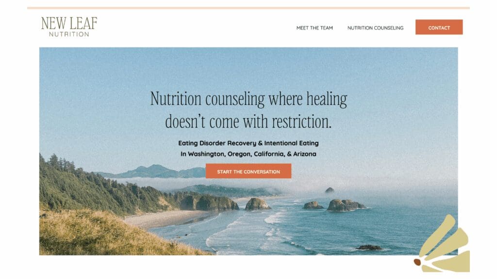
Introducing, New Leaf Nutrition
A group practice owned by Lydia Fredeen, RD, CD, LD located in the PNW and specializing in eating disorders, navigating medical concerns, vegetarian & vegan lifestyles, and intentional eating.
Where It All Began
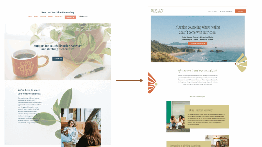
New Leaf Nutrition’s OG site was created in WordPress. It was giving Lydia some serious frustration when it came to editing, causing the site to have outdated information. And we are team “you won’t need me to make minor edits” over here. One of the many reasons I use the most intuitive platform ever, Showit.
Her original website was mainly coral and navy, which didn’t feel in alignment with Lydia’s calm, soothing personality, her love for the outdoors, and nature being a connection point for many of her clients.
The Target Audience
And while we def need to pull in the vibes that Lydia is drawn towards, we equally need to make sure the folks she wants to work with are feeling the vibe too. With all of the New Leaf Nutrition team being in the PNW, I wanted to draw on the inspo of the outdoorsy beauty without being too on the nose. This is a nutrition practice after all, not an ad for the outdoors.
If there’s anything in common with the New Leaf Nutrition clients, it’s that they are adults, want to pursue health without dieting, but they are also a bit ambivalent about how a non-diet approach actually fits into their current lifestyle.
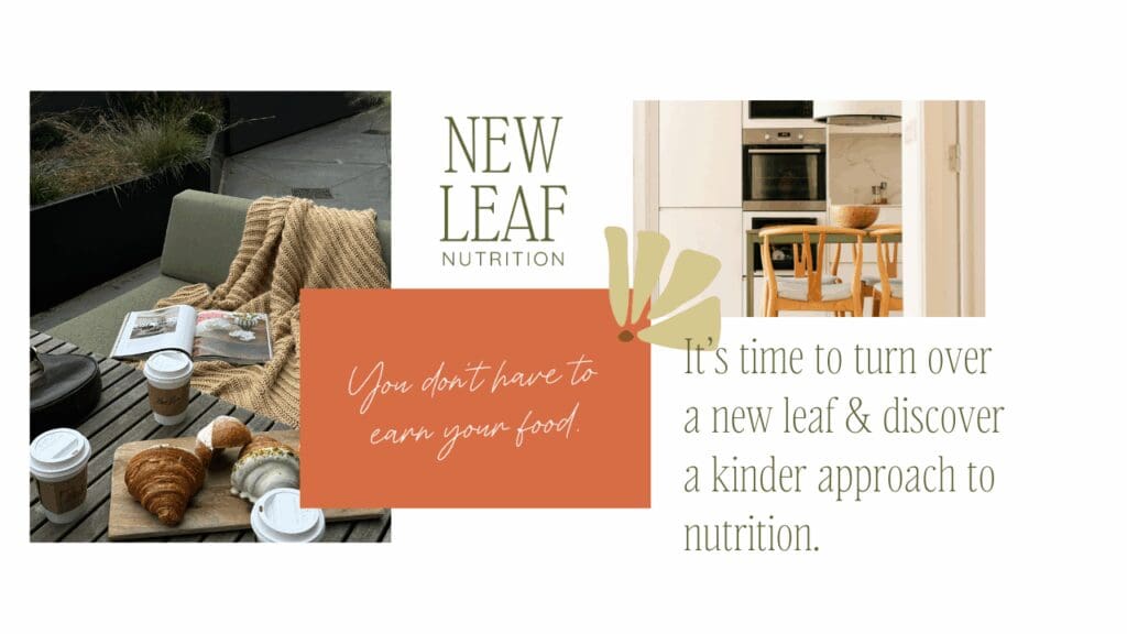
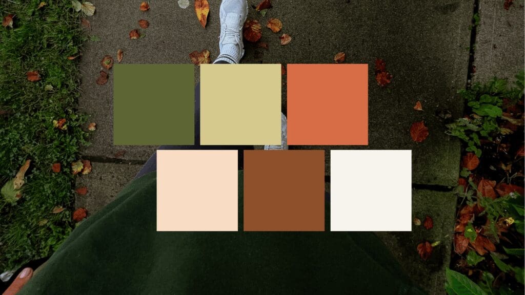
Enter: a warm color palette & approachable fonts that convey that whole “you don’t have to be comfortable when you’re reaching out because this is new and maybe a bit scary” without saying all that.
One of my Fave Moments
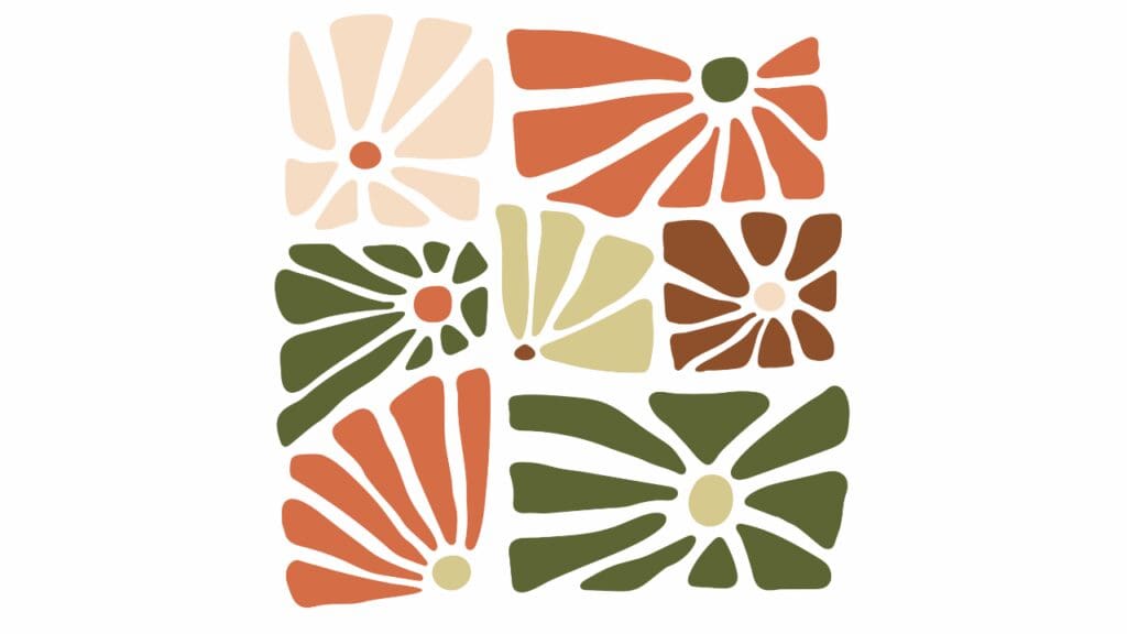
One of my favorite parts of the project was sending over a brand pattern, and Lydia responding with some images hung in her office that looked super similar without even knowing about those prints! Talk about alignment and being on the same brain wave, which is always the goal for branding.
A Glimpse Into The Transformation
While Lydia’s OG site wasn’t bad (not too much text, SEO keywords, and plenty of white space), we wanted to make sure her website was easier to manage. And decided wellllll, why we’re in there we may as well create a visual identity that feels even more like YOU! That’s how we landed on a primary serif font, fully saturated photos, and more direct call-to-actions.
Thinking you too need some guidance on fonts & colors (and literally everything else that comes with branding and a strong online presence)? Then let’s work together.
Hey there, I'm Morgan Sinclair. A dietitian-turned-brand strategist, web designer, and networking-obsessed girly.
If you're a clinician business owner who didn't go to business school, you're in the right spot. I'm a dietitian who did actually go to business school and now I get to share all those nuggets of wisdom with you. Let's set your business up for success by inviting the right folks to schedule that discovery call.